Designing with Data
Here's my notes from two back-to-back talks on how the UK government uses design and data science to make better policy by Cat Drew and Laura Malan.
Data and Design in Policymaking
Cat Drew, Policy Lab
 Phyllis Pearsall made the first pocket-sized street map of London in 1935.
 Florence Nightingale helped to reduce mortality in the Crimean War by taking existing data (causes of death) and presenting it in a new way. Eventually led to changes in nursing policy.
- Data can be used to create practical applications to help citizens
- Data can be visualized in a different way to revveal new insights which lead to policy change
Policy lab is a 10 person team that supports departments across government to use design, data and digital tools to make policy. They look for projects at the intersection of design, data science and digital media.
Traditional data in policymaking
Government generates loads of data, but it's usually presented in 200 page PDFs with a million bar charts, weird maps, bar charts, line charts all that crap
Traditional data, presented better
Used early form of data science to compile data in a massive table Used a distorted map to show where British people were living in the world (which was new in 2006)
 The Guardian: Public Spending Diagram (2011) Source
 David McCandless, Information is Beautiful: The Billion Dollar-o-Gram (2013) Source uses data, puts data points next to ecach other t make a political point
 London Fire Brigade, GDS: Fire Callout Data (2014) GDS Article on this project
 Office of National Statistics: Halloween Data (2016) think of ways to engage the public in data by doing topical design pieces
another way to get the public engaged in data
New types of data used by government
- Government is starting to use more advanced data science
 The Food Standards Agency monitored Twitter for Tweets about illness and used that to predict Novovirus outbreaks
IBM used mobile phone data to redesign bus routes in Ivory Coast Used phone records to find out were people are actually walking instead of relying on assumptions by the city.
Policy Lab project on reducing homelessness Data can also be qualitative. Policy lab does ethnography were you spend time with people and observe them. THis can give you insights that aren't easily captured by statistics.
Sometimes just making data available to people is beneficial
- Traffic light food labelling gives people the data to make better choices about their diet
- This cycle accident map enables people were the safest bike route is
Data can be used to hold the government accountable
police.uk open data Worked for months to get the the police to publish all of their arrest data. This gives people the arguments they need to make change happen
London air pollution map The current debate about air pollution in London could only really happen because high-quality data became available for everyone to look at.
Anna Powell-Smith: What size am I? Interactive graphic that shows what dress sizes are offered by different shops, can be used to put pressure on those companies.
Cat Drew, Dalston Gentrification Final LCC project; plotted every shop on Kingston road and what year they opened up. Data has to be presented in different ways to different communities.
Ways designers are involved in data science projects:
1. Data collection
How do we get data from people in a way that creates trust and helps people understand wht we're trying to do? For a traffic project we had to put up huge posters on the m4 to tell people they were using their phone data. Thnik about what sort of question you can ask people and how you ask it.
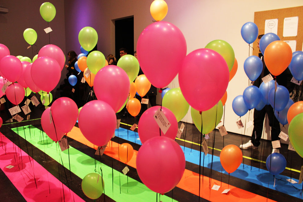 Signal Noise: Big Bang Data Asked people to answer questions on a card, then attach that to a balloon with a length of string according to their age.
2. Data Magic
Not much (I think designers should know about this)
3. Using the Data
GDS: Future of ageing Collected loads of academic evidence about the aging population; 200.000 words in total that no public servant could ever read.
Policy Lab broke the information down into cards that made much more digestible chunks Worked with an illstrator to create personas, making the data more human allowed civil servants to think more clearly about policy changes that needed to happen.
Citymapper built a feature that lets you choose a rout were you're in the rain for the least amount of time. Again, thinking about what sort of people need at what point in their day.
Christopher Murray: Global Burden of Disease Comparison Led to an effort by the NHS to prevent diseases they weren't aware of being a problem
Sometimes you need to do things that are counter-intuitive to get people to trust your data: This phone book company in the 70s launched a service were you could call an a computer would give you any phone number you needed. However people didn't trust the machine because the result came pretty much instantly, so the phone company had to play a recordign of someone flipping through a phone book for a couple of seconds so people would believe the result. Today Skyscanner is doing the same thing.
Designing with data
Laura Malan, uscreates
Here's a project Laura and Cat have been working on for two years
Designing data is different to designing with data, and both can be done at the same time. It's good to use quantitative as well as qualitative data. One gives you facts and numbers, the other helps you understand reasons behind those numbers.
How can we support people to manage their health conditions and stay in work?
- 2.5 million people are on benefits, costs about 50bn a year
- Statistics show that once someone is on benefits they become unikely to go back into work
- Complex problem needed a big and complex design team with different government departments, service providers, data scientists, ethnographers
- Here's more on that project
1. Use data to see patterns
Made a graphic that shows the flow of people from empoyment into different stages of benefits and back, looks like the user flow diagram on Google Analytics
2. Data =/= Insights
had to use design techniques to understand complex data sets identified clusters of people in benefits, pulled those out and visualized them
- humanise data data science is good but human info has a big impact went out and talked to people to get their stories, in depth interviews, give people cameras to capture diaries
- confidence and resilliance are keyfactors in terms of empoyments
- flexiility is imprtant
- cultire of the emplyer is key in you managing your health
rich ethnography data and stories and names and photos helped them communicate data to policy makers.
data visualization as a tool can be a powerful tool to communicate evidence created user journeys for people who flowed in a nd out of work shows that people have wuite complex journeys, come in contact with many agencies
use data to solve problems use data to solvve design problems work out problems you hav to solve
Questions
Can you give an example where you could show the benefits of a design project using quantitative data?
police data, using data to improve crime victims experience online crime recording tool got qualitative feedback
How is data-driven design going to change in the future?
gonna get a lot more data from the nternet of things doctors will be able to remotely diagnose robots driving cars data ethics will become more important
How do you avoid biases in your design process
nyc street bump app biased towards rich people historic data might have biases (racial biases, gender biases) you risk just conforming, perpetuating biases
live data and data around that are there people usign live data gov.uk performance platform, page analytics gives us a sense of what people are searching for from government perdicitive algorithms allow us to predict what people might need at different times in the year