2016 Paralympic Games
Channel 4 had done a good campaign four years earlier, it's always hard to go second. The basic idea of the campaign is to broaden the focus beyond athletes onto normal people living with disabilities. The tagline is "Meet the Superhumans".
Did this ad (the production value!) Put extra care into making things like the sign-language version fun and accessible.
Winter Paralympics
Channel 4 had the rights for the winter paralympics in Sotchi, but they didn't really want to endorse the anti-gay laws Russia was passing at the time. So they did this spot:
More on the Gay Mountain Campaign
Humans
Did quite an extensive marketing campaign for this show about robots. Included a Facebook chatbot, fake product recall ads (with no channel 4 branding on them), fake interviews on actual TV, Snapchat things etc.
E4 Shutdown
Were briefed to do a get out the vote campaign for E4, ended up shutting the channel down for a day. (Similar to what Nickelodeon used to do).
Alternative voices
There's this thing on TV called continuity, which is the little bits of spoken language in between segments, for example the following programme might contain strong language. Traditionally this is always a very BBC voice actor. In keeping with the "casting disabillity in a different light" theme they gave this to people with communication issues:
Channel 4 Rebrand
Channel 4 has this 1984 logo which is apparently an iconic piece of graphic design in this country:
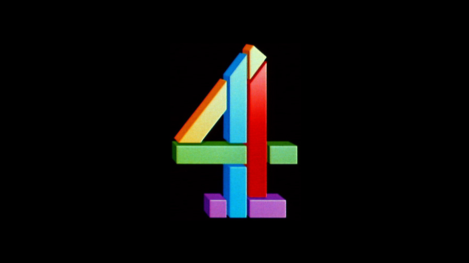
For the rebrand they kept the puzzle parts of the logo and changed scale, number and colours. They're longer constrained to be in the four shape.
The blocks become a graphic device which works in all sorts of contexts, with type on top of it etc. But it always keeps this tangible 3d look, which is great for motion graphics. Looks like they got DBGL to do the execution.
Here's a smart thing they did for The Simpsons: 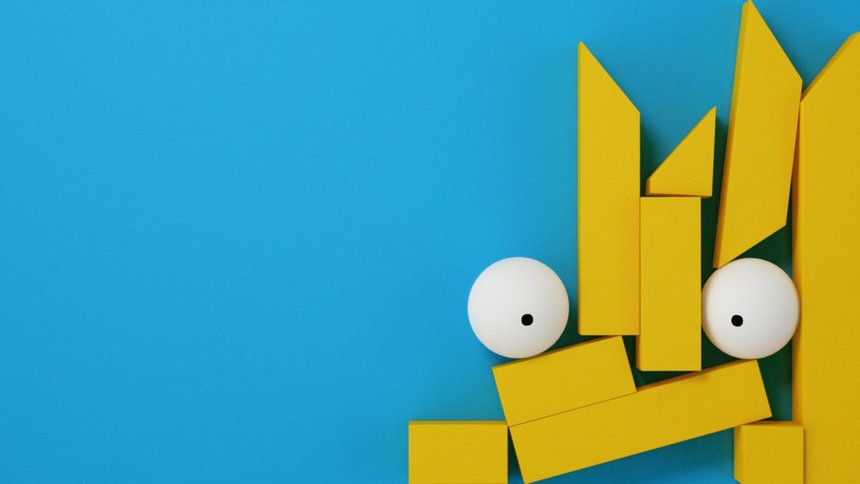
Neville Brody did the two new typefaces, Chadwick and Horseferry (which is their street address). One display, one text face.