The Herschey Fonts
Notes from Frank Grießhammer's lecture on the Hershey fonts at the Cooper Union, 2016.
Minotaur has a lombardic uppercase made entirely out of straight lines.
The Herschey fonts are a collection of vector fonts developed in 1967 at the Naval Weapons Laboratory (in Virginia). They're publicly available.
Archive.org (and Google Scholar) has Herschey's paper Calligraphy for Computers. In it, he writes about type design for a coarse grid as an artistic challenge. He's clearly an interesting person: artistic, but also extremely technical.
The paper has 200 pages, most of which are drawings of letters, including the lombardic caps from earlier.
Who is Allen V. Herschey
Worked as a physicist at the Naval Weapons Laboratory. He was a theoretial physicis (fluid dynamics). He was also apparently a calligrapher.
How did he design his letters? He drew out each letter on graph paper, using only straight lines. He drew a complete Japanese typeface, too.
The guy wrote all these technical reports. Mathematical typesetting in the 60s was done on the Veritype. You also had a product called Type-It, which were basically replacement type that you installed in your typewriter to get, say, Greek letters. Herschey wanted to improve this process.
The Naval Weapons Laboratory had a computer called the NORC (Naval Ordinance Reference Calculator, 1954) - the fastest computer in the world at the time.
It was attached to a line printer, which would print onto these long continuous sheets of paper: A General Dynamics S-C 4020.
General Dynamics: The Mark of Man (1963)
In this video they show a stencil method to project letterforms (similar to phototypesetting), but Herschey used the vector drawing method instead (this just sent the beam through the period and used it to draw). Here's some marketing copy about the S-C 4020:
Once upon a time [...] the computer-printer generated only row after row of numbers and symbols, it was only used by the engineers. The took their armloads of papers to the drafting department, where an army of draftsmen and clerks converted the figures into charts, graphs, and drawings. [...] Then a bright engineer learned about a new kind of machine called the S-C 4020 that takes the information froma computer and converts it into curves, graphs and pictures.
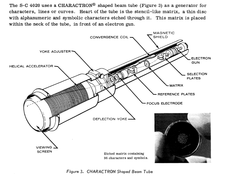
The CHARACTRON shaped beam tube of the S-C 4020
http://www.chilton-computing.org.uk/acl/pdfs/sc4020_inf_manual.pdf
The S-C 4020 was a technical milestone. It could do arbitrary vector drawings, and even produce animation. Most of this material seems to come from Chilton Computing.
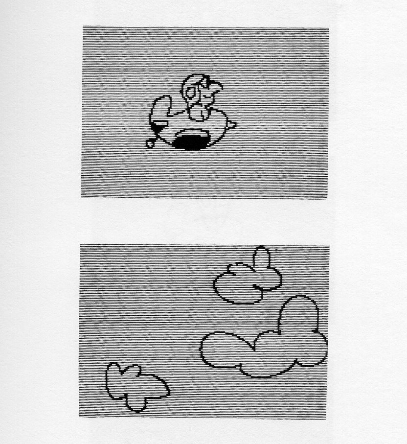
Vector drawings produced by the S-C 4020.
http://www.chilton-computing.org.uk/acl/technology/sc4020/p011.htm
Herschey knew the machine:
- Plotting of Curves and Alphabet on the NORC CRT Printer (1959)
- Plotting of maps on a CRT Printer (1963)
- FORTRAN IV Programming for Cartography and Typography (1969)
Did quite beautiful drawings of ships, too.
The type
Herschey's designs are quite exhaustive. he drew five optical sizes: FORTRAN, Cartographic, Indexical, Principal, and Triplex (Going from caption to display). Multiple stroke styles (one, two, and three). There are also calligraphic designs, a Schwabacher, the Lombardic capitals.
In total he drew about 1500 Latin characters, 800 Japanese. It's quite the achievement. Actually did real type-design research for these, too.
The FORTRAN style comes from the Leroy Lettering Set (used for comics a lot).
While these typefaces are available, they only come in an ancient plain-text format. Grießhammer wrote the necessary Python to turn this into properly-encoded OTFs (albeit with a stem width of 0) - looks like that's this repo, though it doesn't contain the converted font files. Here's someone else's attempt from 1997.
This is speculation from me, Max: I'm assuming this material flowed into the MAD Family from Colophon (especially the three weights produced by repeating the outline), though they don't seem to acknowledge it in their marketing copy.