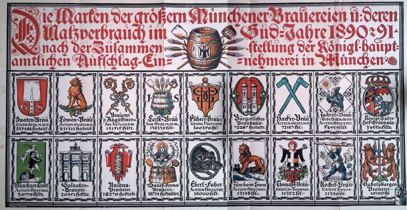
A chart of Munichs breweries in the 1890s
August Genzsch co-founded the Genzsch and Heyse type foundry in Hamburg in 1833. Heyse died pretty soon so this is really the Genzsch Foundry. Hermann Genzsch retires in 1933.
Genzsch was an apprentice at Breitkopf's inhouse type foundry, who still publish music today. Then became a foreman in a type foundry at Frankfurt, then moved onto Hamburg where he set up his own shop.
In 1834 G and H bought a foundry called Lampe which was absolutely ancient (founded in 1589 possibly). With that purchase they got many punches and matrices. Some very old, like a Schwabacher from the 17th century.
They introduced old style types into german type founding. The genre comes from England, and they got their first set of matrices from an English foundry. They were criticised at first, but these English styles became popular quickly.
How did they buy matrices? There was a big market for that. Only about half of type foundries made new typefaces, the rest just bought matrices and produced the type. There was electroplating, which means you can copy matrices, and you can copy existing typefaces without cutting new punches.
G and H though probably always did have their own punchcutting unit. American wood type makers started using the pantograph in the first half of the 19th century. Metal type pantographs probably came from Germany, later in the century. The spread was slower because the Germans were traditional and had plenty of good punchcutters.
In 1876, a punch cutter named Albert Anklam joins the foundry from Berlin. Until 1885 he must have been the chief punch cutter, a key position.
In 1876, they rease Neue Schwabacher (designed and cut by Anklam) - a modernised version of Schwabacher from the 17th century. This was one of the most succesful type releases in Germany up to that point.
It's unclear how many foundries bought copies of the matrices, and how many just copied it with electroplating. This was around the time Germany brought in patent law that allowed them to patent the design, although that only protected the design for a few years. Because this was such, the inital batch of foundries that sold this probably bought the matrices, while by the 1890s people were probably stealing the design.
Why the success of Neue Schwabacher? German unification: until 1871, there was no Germany - just loosely connected territories forming a thing called the German empire. The first graphic style to become popular in this new country was deeply historicist.
There was a show in Munich called Our Fathers' Works which revived interest in the German rennaiscance. This is why this historicist style is sometimes called the Munich Renaisscance. Their heros were Dürer and Holbein.
Now onto Otto: Otto Hupp was trained in engraving by his father. His first comission was a medal for a shooting competition. The process for cutting punches for things like this is the same as you use for punchcutting for type.
His primary area of activity wasn't type design or lettering but heraldry: he's a heraldic illustrator. His longest-running graphic project were the Munich calendars. These are pretty wild relief prints. They were popular, print runs of 27,000 copies at the height of their popularity.
In Munich, Hupp becomes attached to a decorative artist called Seitz and starts drawing ornamets for type foundries - these were pretty important at the time.
Emil Julius Genzsch comes to Munich and buys a local type foundry, turning it into a subsidiary. It's possible that they stopped selling their matrices to domestic foundries at this point to German foundries, now that they could serve the whole country (including the South).
Hupp starts working for G and H. While the factory was bombed in the Second World War, Hupp's house wasn't, which is why we still have many of his drawings.
We don't know exactly how they went from the drawings to sorts. But here's an idea: They photograph Hupps clean ink drawing. They transfer that onto a plate and etch it. They place the plate into a bath with a piece of copper to electroplate it. You make a copper form that you cut off from the original plate, mount and sell.
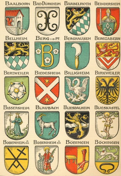
Page from Die Wappen und Siegel der Deutschen Städte, Flecken und Dörfer.
This happens to be printed in Hupp's first text face release. This typeface was called Numesmatis. This was only made in 8pt, all caps, lombardic. This was for a specific editorial design need: They needed to transcribe text from seals inside copy set in regular Schwabacher.
In the 1890s they make a more ambitious tpyeface: Neudeutsch. G and H printed several specimens and other matter for it. The typeface comes out in 1899 or 1900. It has lots of sizes, initials, ornaments. Hupp probably didn't design the specimen. The design of Neudeutsch doesn't really change between point sizes, so Hupp probably only submitted one set of drawings. The factory would have scaled these drawings photographically with some slight modifications. Although they didn't use it here, Hupp did later think about optical size adjustments.
It's a type genre that combines elements of roman and blackletter. Hupp wasn't a calligrapher, he drew his letterforms. Hupp never left the Munich rennaiscance, even when that was eventually replaced by Jugendstil, the German branch of Art Noveau. Lettering in that time was ahistorical - based on nature, not on historical examples.
Neudeutsch wasn't very successful because a) there was a similar typeface of the same name by another foundry, who also distributed matrices of their typeface to other firms and b) in 1900 Eckmann comes out, which becomes a bestseller. Hupp hated it.
Hupp, like everyone else makes an Eckmann challenger - Dreikönigsschrift. But this never comes out. The last typeface of Hupp's is Heraldisch between 1908 and 1910 - it's unlceear how much hupp was involved here.
Between 1910 and 1924 hupp draws all kinds of typefaces for Klingspoor. The first typeface is a narrow textura called Lithurgisch. This was designed for religious publications, both for catholics and protestants. There's a wild 1908 specimen, probably the longest one ever printed for a metal typeface. This is where they start to understand and use optical sizing. Lithurgisch didn't sell that well.
1910 Klingspoor publishes Hupp Fraktur. Hupp illustrated the 1940 edition of Klingspoors annual calendar - the 500th anniversary of european printing.