Documenting web design work
If you make websites for people, you probably want to show that work in a portfolio of some kind. What's the best way to do that?
Let's look at some options
I'll list them roughly in order of elaborate-ness.
Linking to the live site
This requires the least amount of effort on your side, and arguably it gives people the most accurate impression of your work. They can click around the site, look at animations, and see your design work at different screen sizes by resizing their browser. They can even look at things like loading times and accessibility if they're so inclined.
The biggest potential downside is that you can only really link to one page — typically the homepage. If you spent weeks designing a beautiful article template, people looking through your portfolio might never see it. This becomes even more of an issue when you're working on an app. In that case most of your work probably lives behind some login system, which makes it difficult for people looking at your portfolio to access.
In any case, you should probably throw in a link to the live site even if you're using screenshots or some other presentation method. Should you set the link to open in a new tab? Probably not.
Screenshots
In my experience, screenshots are probably the most popular way to show web design work. They're easy to produce, you can have more than one to show different parts of a site, and they allow you to show stuff that's behind login systems.
There's all kinds of ways to do them:
The Window-less Screenshot
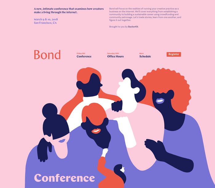 Bond Conference 2018 website by Andy McMillan et al. Via Fonts in Use
I'd say this works best when the site has a coloured background that makes it stand out on your portfolio, like the one above. Then it's a nice, clean option with nothing there to distract from your work.
These also have the advantage of being pretty easy to produce. Chrome and Firefox both have built-in tools to take regular and full-page screenshots.
The Minimal Windowed Screenshot
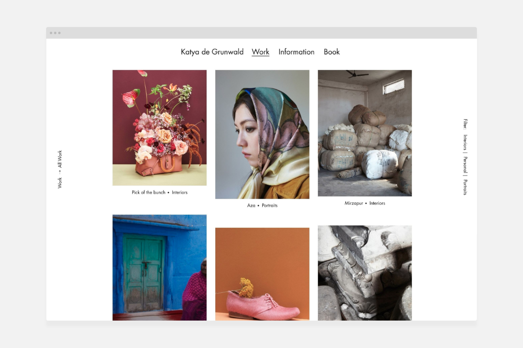 Katya de Grunwald by Studio Thomas. Via Fonts in use
I can think of two ways to make these.
- Do the whole thing in Illustrator: Draw up a browser window, import a screenshot of the site and export the two together as a PNG.
- Do it programatically. Draw the browser window in Illustrator as before, but this time export it as an SVG. Then write some front-end code that inserts all your screenshots into that browser window automatically. You could get pretty clever and have it respond to different-sized screenshots automatically. You could even automate the screenshot-taking itself through some kind of headless browser, but that's probably taking things too far.
The Windowed Screenshot
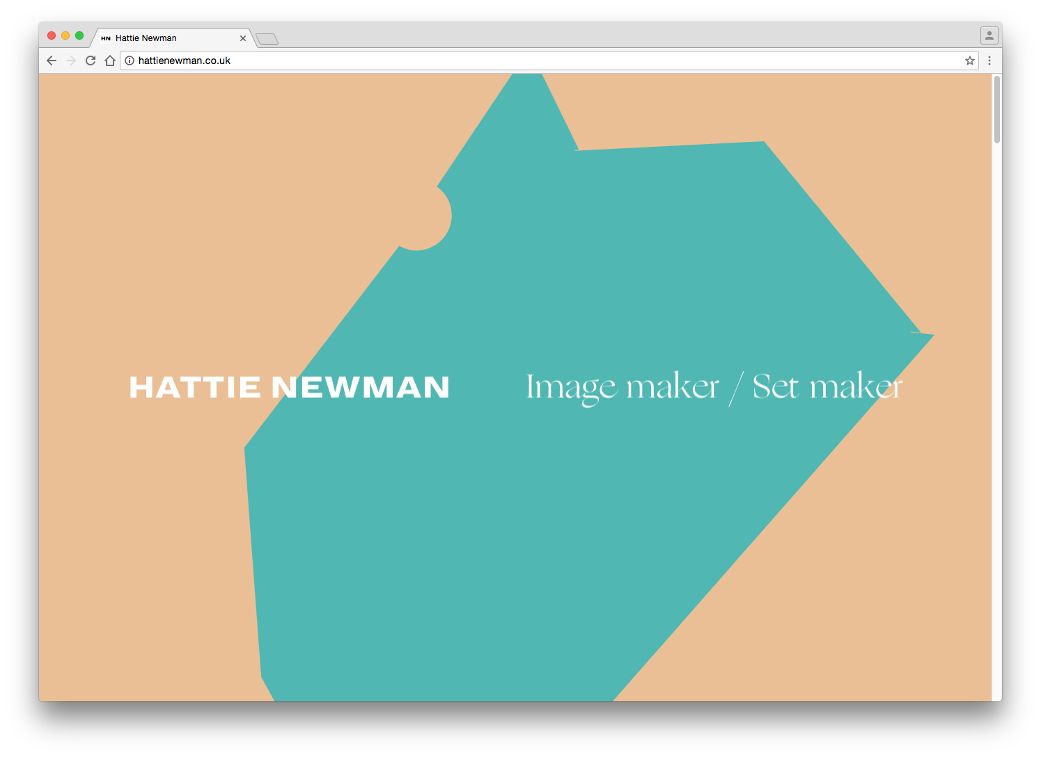 hattienewman.co.uk by Art Department/Hattie Newman. Via Fonts in Use
I like these because they give people a sense of scale of your work. With the browser interface acting as a reference point, it's easier to judge how big things are in proportion 1.
You definitely want to set your desktop background to a nice colour and make your browser window look as clean as possible. Hide the bookmarks bar, close all other tabs, and hide all plugin icons. It might even be worth using a different browser if it has a nicer-looking interface. Chrome and Safari seem to be the most popular, though I do see Edge every once in while.
Apparently the drop shadow in the example above is a native feature on Mac. I can't really think of a Windows equivalent other than setting your desktop background to white and manually taking a screenshot that includes the drop shadow.
The Screenshot-on-device
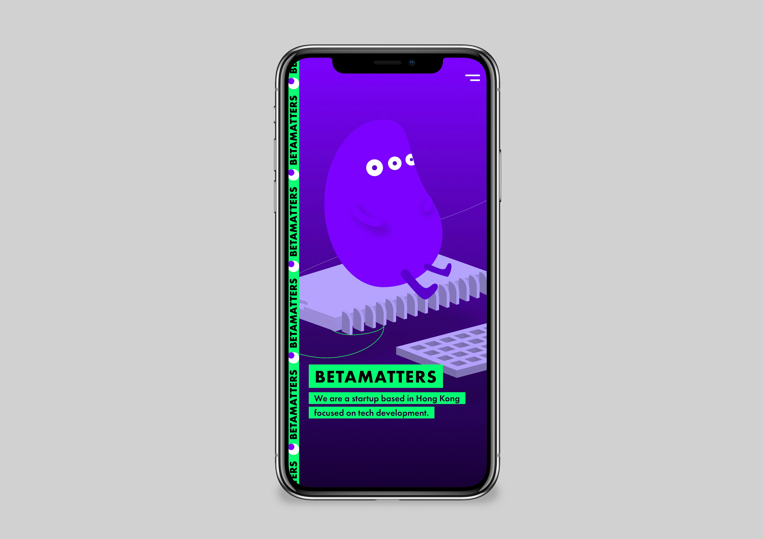 Betamatters by Chiu Candy. Via Fonts in Use
If done tastefully, these can be very effective. The device establishes the scale of your work, just like the browser window in the previous example.
A popular variation of this is what I call the triad:
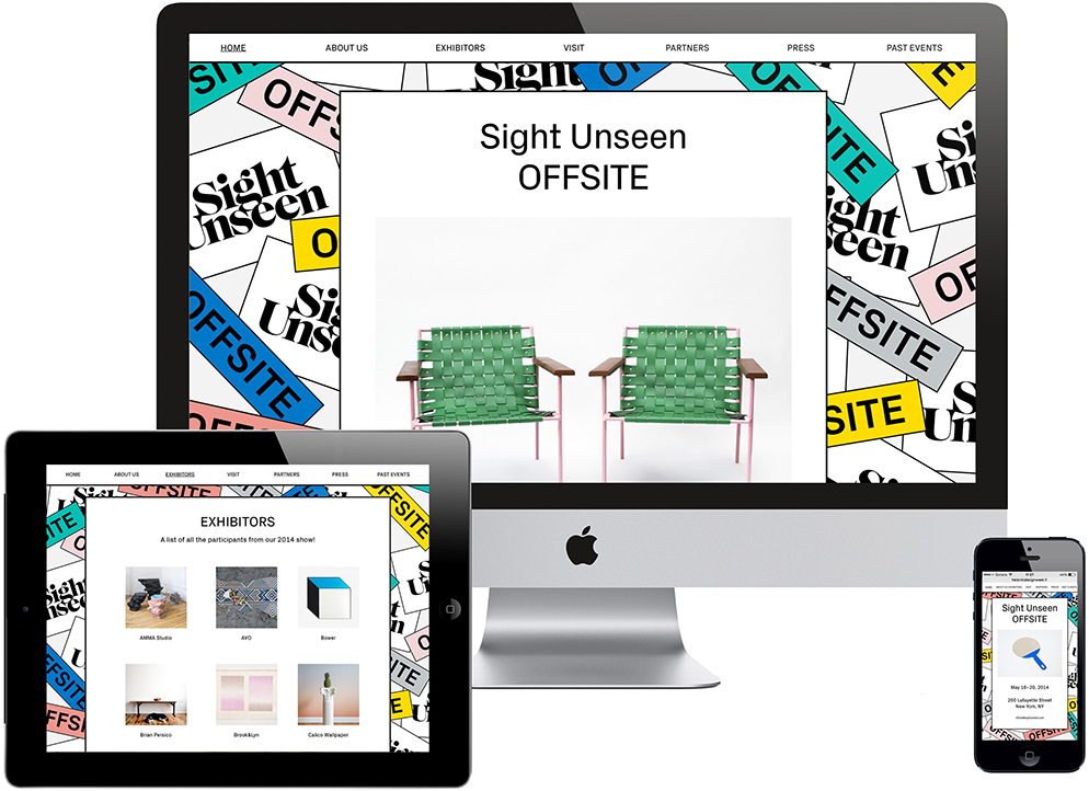 Sight Unseen OFFSITE by Kokoro & Moi. Via Fonts in Use
I remember these being extremely popular when responsive design was new. Showing the site on a desktop, tablet and phone was a way to show off you were part of the movement. Responsive design is pretty much the default now, so I'm not sure it's that much of a selling point anymore.
The biggest issue with the screenshot-on-device might be how quickly devices become outdated. If your portfolio is full of iPhone 4 mockups, that's not the best look. Do you go through every couple of years and redo all your screenshots on modern devices? Is this worth automating?
As far as device images go, Facebook seems to have by far the nicest ones. I like the idea of looking beyond the typical Apple devices - maybe your work looks better on a Microsoft Surface? 2
The screenshot-on-device-in-hand-in-coffeeshop
 Via Facebook Design
Facebook seems to do this a lot. I think it works for them, maybe because we're already so familiar with their interface we don't need to see it in detail? Most of the time though, these feel kind of cheesy to me. Who holds their phone up in front of their face like that?
I guess it all depends on the audience you're trying to address. If these full-on mockups seem right for you, there's all kinds of products that make it easy to generate them. This looks like one of the nicer ones.
Video
[AKU Collective](https://aku.co/). Via [Hover States](https://hoverstat.es/features/aku-collective)
Videos are great. They can show off multi-screen flows, animations and fancy interactions all at once in a digestible way.
They're also surprisingly difficult to produce. First, you need the right recording software — I like the built-in game recorder on Windows (press Win-G and you're good to go). You probably also want to trim the recording and export it to the right format, so you need software for that.
Once you've worked out your software situation, you need to do the actual recording. The last time I did this, it was much harder than I thought. You want to move your mouse around calmly, scroll up and down slowly and pause at the right moments to give people a chance to take in the work — pretty much the opposite of how I'd normally interact with a website.
I found it helpful to write down a little script to remind me what I was doing: Click on the about page, scroll down, interact with the slider, open the menu etc. Even so it took me multiple attempts to get a decent result.
Embedding the site as an iFrame
This seems to have a lot of upsides: You don't have to mess with screenshots or recording software. It's interactive, and animations play in real time. You could even make the iFrame resizable to show off how your design works at different screen sizes.
On the downside: Since you're loading a whole website inside that iFrame, performance could be an issue. There's also the risk that the client makes some drastic change to their site. What if they bring on another designer and they start to make changes? It would be weird to have their work pop up on your portfolio.
AKU Collective are one of the few people I found doing this out in the wild.
Conclusion
There's all kinds of ways to show web design work. Screenshots are probably a good default choice. I tend to gravitate towards the more minimal mockups, but your work might need a nice coffeeshop around it. We can probably stop doing the triad at this point. If you're doing a lot of animation work, videos or iFrames might be a good option to show that off.
In any case, make sure you link to the dang thing.
in this vein, I also like the Dropbox idea of designing interfaces in a simluated desktop enivronment. They're using this primarily as an internal design tool, but maybe it could be a way of presenting finished work, too? ↩︎
Facebook also has good photos of phones in hands. ↩︎