Type Methods
Notes from Type Methods at the Royal College of Art
7 November
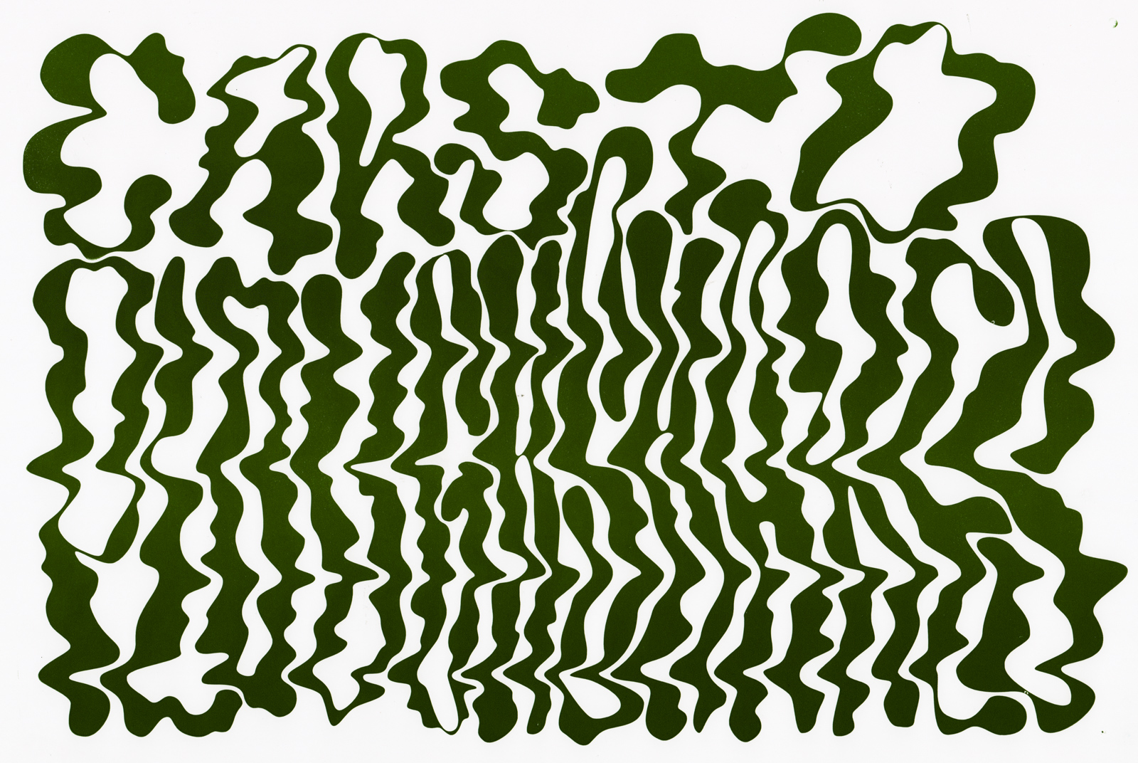
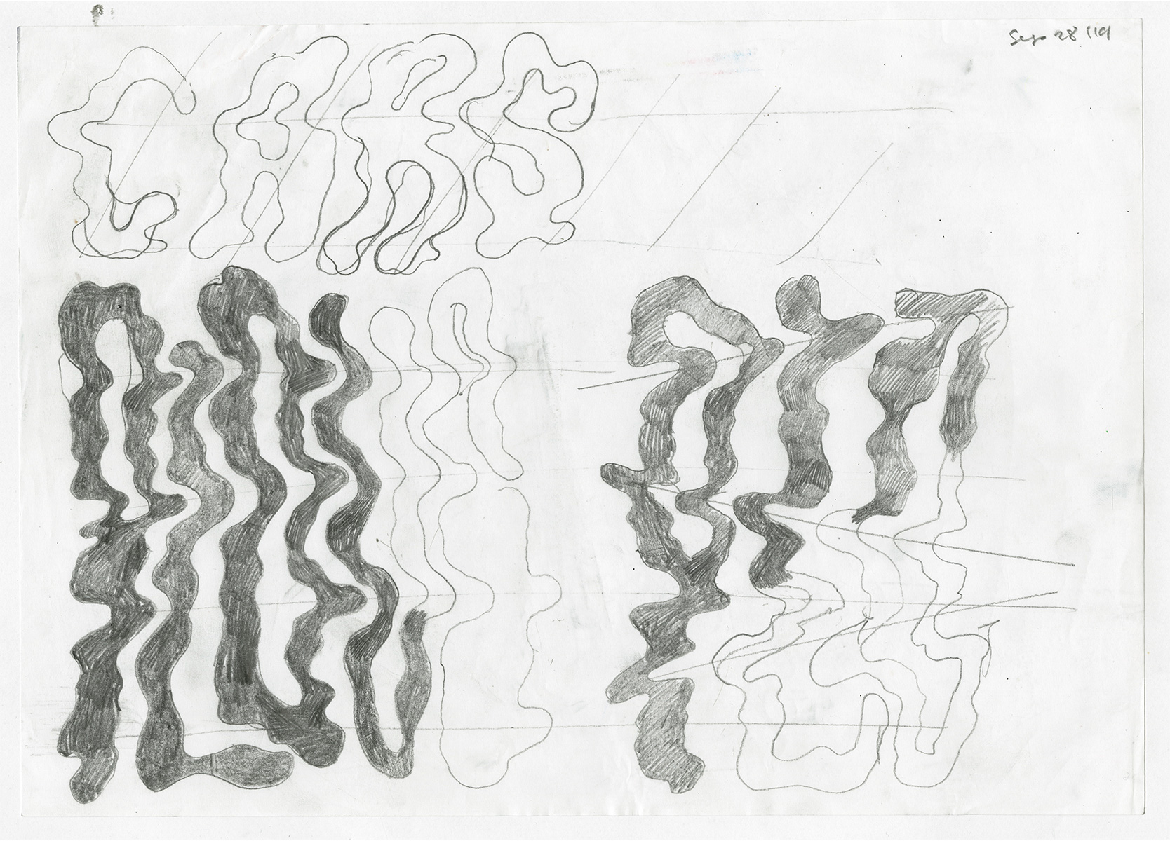
Hoping to develop a typeface out of this lettering I did:
Maybe also take some stuff from Node Paint (extended pen nib).
14 November
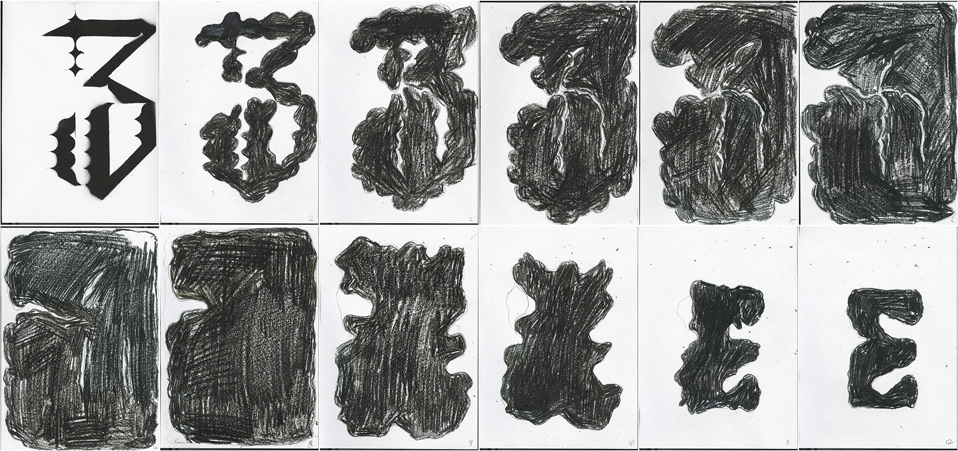
Above might be useful for bold weights down the line.
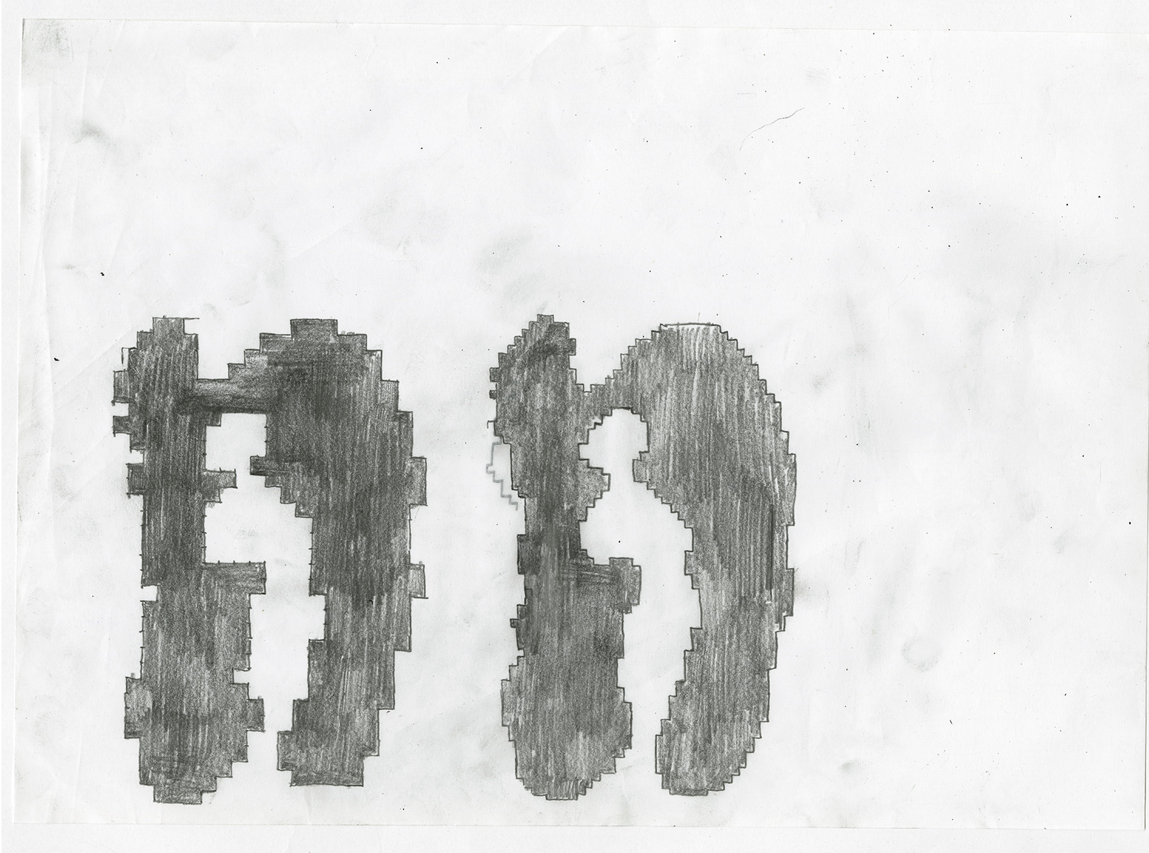
15 November
- Like the contrast in the H and A.
- Horizontal stress
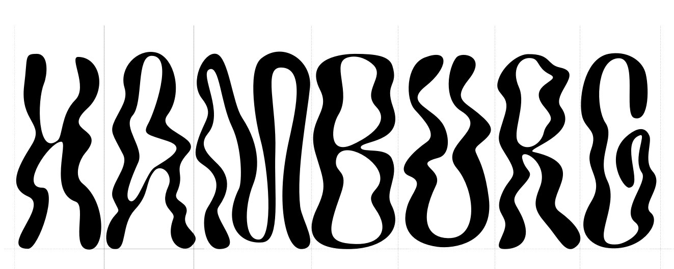
17 November
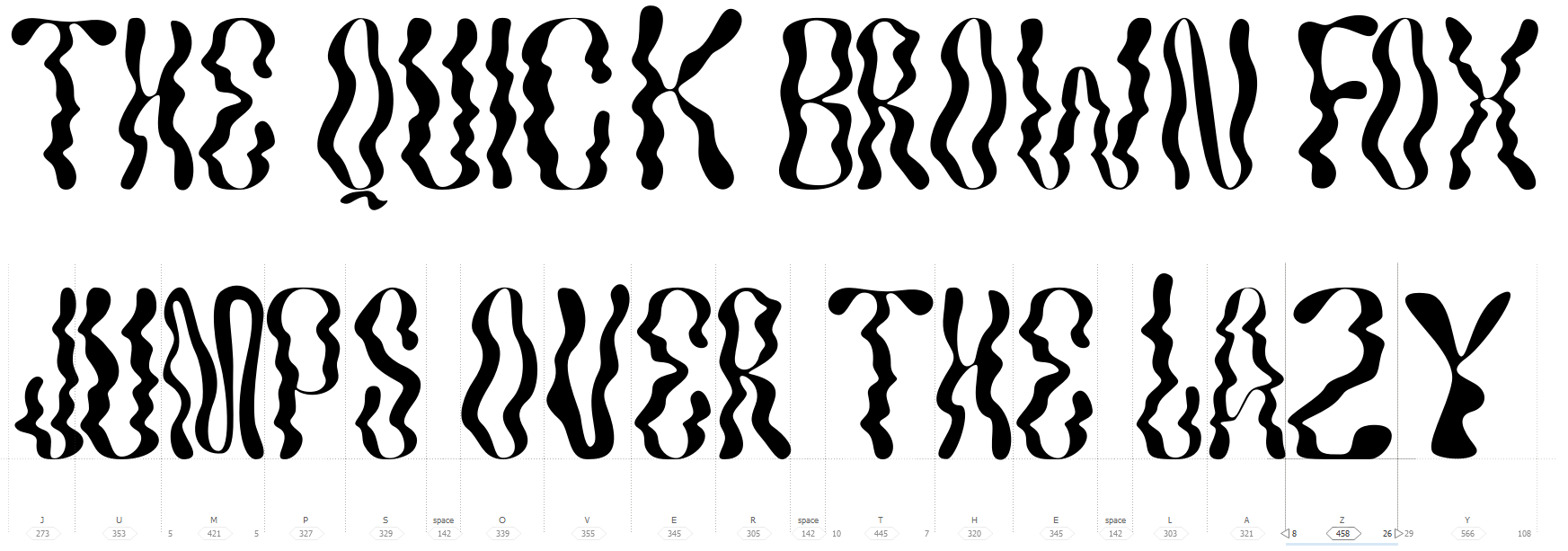
V1 of the uppercase nearly finished. I'm trying to keep the wiggles in the same position vertically, so I can eventually kern the letters into each other like I did in the original lettering. Consistency is good, but might lead to the letters looking too similar (boring).
The number of wiggles (left-right-left from top to bottom) makes the letters quite busy — maybe number of squiggles could relate to optical size? I like them in the O and R, much too pointy in "W" and "A". Weight also inconsistent.