Eilis Searson
Portfolio website for the designer and lecturer Eilis Searson
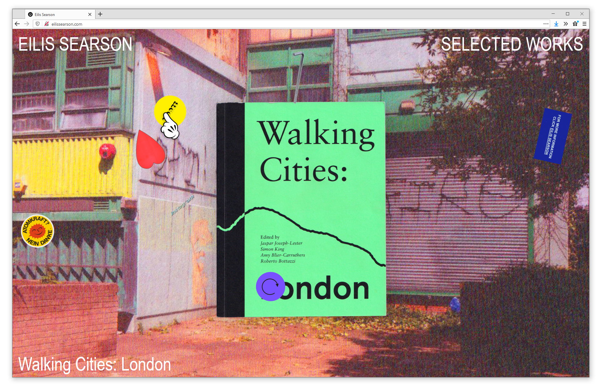
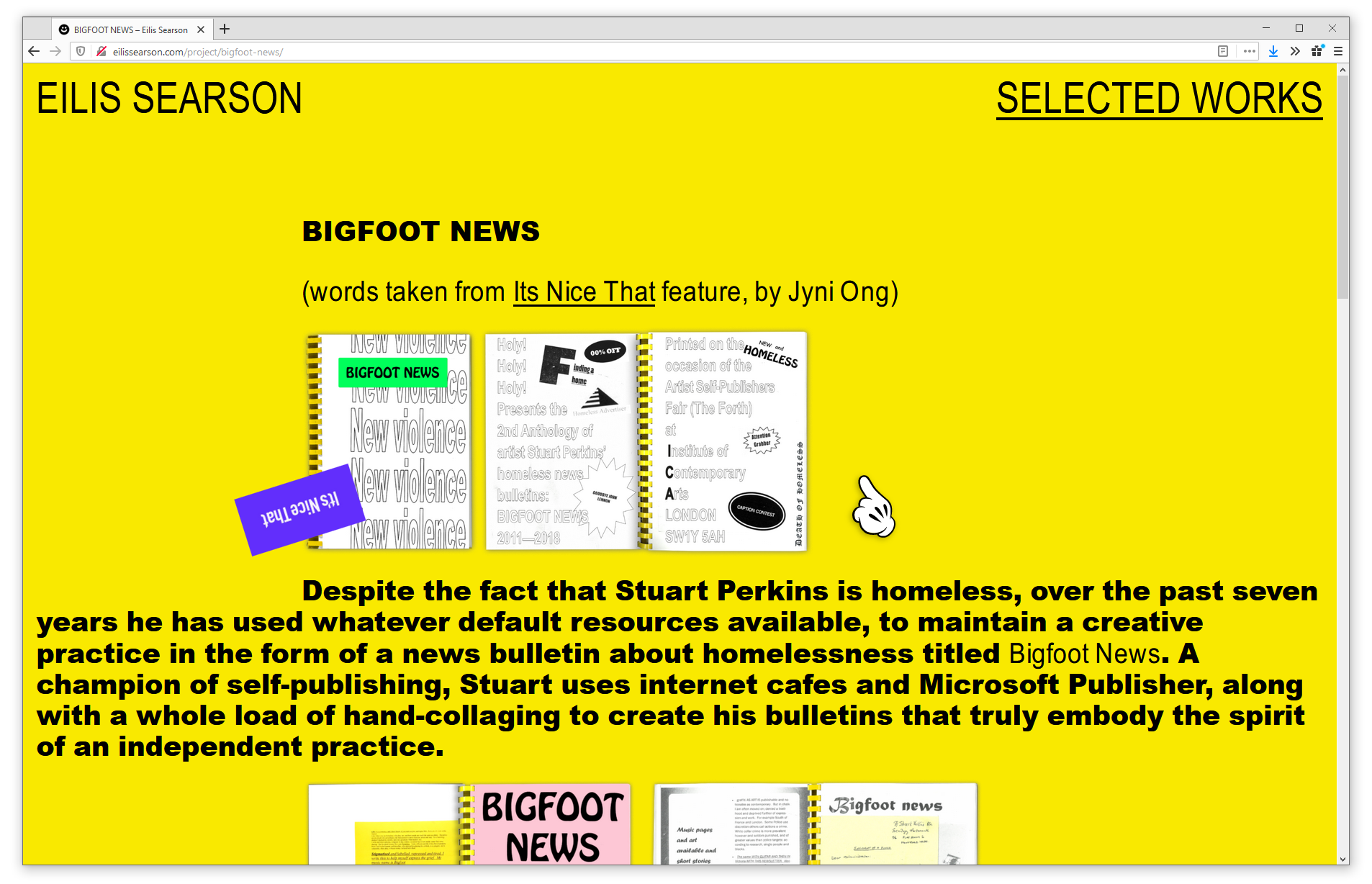
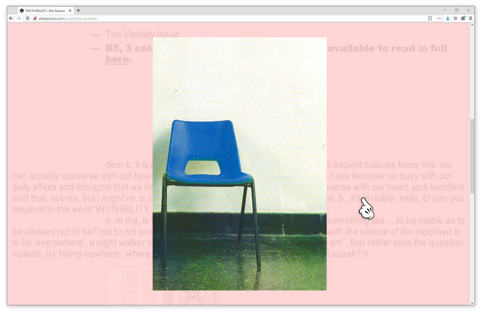
Portfolio website for the London-based designer and lecturer Eilis Searson. The site documents Eilis's work as a series of self-contained, art-directed stories that capture the vivacious spirit of each project.
The typography of the individual project entries (particularly the use of a heavy sans-serif for bodycopy, wide paragraph indents, and vertical image captions) comes from John Berger's Ways of Seeing, a formative book for Eilis and me.
Ways of Seeing (1972) by John Berger and Mike Dibb, designed by Richard Hollis.
We considered setting the site in Univers Black to match the book, but our digital version didn't have the strength of what Richard Hollis was using in 1972. Instead we used Arial (Robin Nicholas and Patricia Saunders) in Regular, Black, and a custom squished cut I originally produced for the readings on loveactually.works. It's more energetic, and connects better with Eilis's work.
Concept, art direction, writing and stickers by Eilis Searson. Design, development, font engineering and Mickey Mouse cursor by me.
View the live site at eilissearson.com.